langcheck.plot#
langcheck.plot contains functions to visualize the output of metric functions (MetricValue objects).
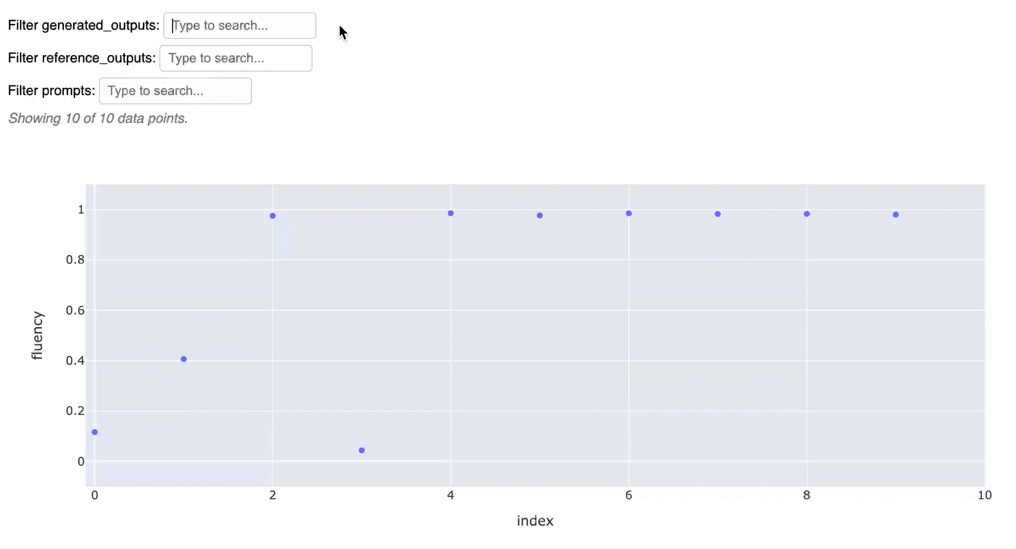
For example, run langcheck.plot.scatter() in a Jupyter notebook to see this interactive scatter plot:
Tip
As a shortcut, you can run plotting functions directly on an MetricValue. For example, toxicity_values.scatter() is equivalent to langcheck.plot.scatter(toxicity_values).
- langcheck.plot.histogram(metric_value: MetricValue, jupyter_mode: str = 'inline') None[source]#
Shows an interactive histogram of all data points in
MetricValue. When run in a notebook, this usually displays the chart inline in the cell output.- Parameters:
metric_value – The
MetricValueto plot.other_metric_value – If provided, another
MetricValueto plot on the same chart.jupyter_mode – Defaults to ‘inline’, which displays the chart in the cell output. For Colab, set this to ‘external’ instead. See the Dash documentation for more info: https://dash.plotly.com/workspaces/using-dash-in-jupyter-and-workspaces#display-modes
- langcheck.plot.scatter(metric_value: MetricValue, other_metric_value: MetricValue | None = None, jupyter_mode: str = 'inline') None[source]#
Shows an interactive scatter plot of all data points in an
MetricValue. When run in a notebook, this usually displays the chart inline in the cell output.- Parameters:
metric_value – The
MetricValueto plot.other_metric_value – If provided, another
MetricValueto plot on the same chart.jupyter_mode – Defaults to ‘inline’, which displays the chart in the cell output. For Colab, set this to ‘external’ instead. See the Dash documentation for more info: https://dash.plotly.com/workspaces/using-dash-in-jupyter-and-workspaces#display-modes